Design for the age of disorder
We live in challenging times: even before the pandemic hit in early 2020, we experienced a world of constant disruption, of heightened uncertainty, increasing economic inequality, political polarization, geopolitical tensions, and social fracture and unrest. A world that can seem unfamiliar and unpredictable to us.
In a September 2020 Deutsche Bank report, historian Jim Reid argued we’re entering in an “Age of Disorder”, after “The second era of globalization” (1980–2020), which was marked by a rapid growth in global trade, but also in economic interdependence, complexity and fragility.
In communications, despite hyper-connectivity, we live in an era of misinformation and mistrust, of post-truth and “alternative facts”. An era in which news are optimized for maximum shock and outrage, and in which for many people, their main source is social media, with its risks of filter bubbles and echo chamber effects.
All of this affects our sense of shared reality with others (not only of shared experiences but also of shared perceptions). This can make us feel like we’re not living in the same world with the “other side”. The division and discord feel threatening and bring out anxiety at a collective level.
In this context, many of the visual trends we can see in mainstream media in the last few years can be thought as external reflections of these ideas and sensations, or as translations of them to the visual language of shape and color. These trends work with our sense of a world that feels increasingly strange, and that is the opposite of familiar and comforting.
As we mentioned, two of the main concepts are division and distortion. We can see them represented in different ways, such as:
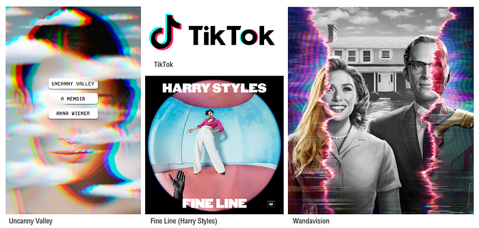
The use of sliced typography, especially in many posters for movies and series. A lot of these portray present or near-future dystopias: worlds that feel dehumanized, either because of the rule of technology or of authoritarian leaders, where the result is often forced uniformity and monotony.

To represent distortion, different optical effects are used, like RGB split / color fringing (such as in the TikTok logo) or the Fisheye effect.

We can relate both of these to the “glitch” aesthetic, which uses errors (e.g. from software or TV) as an expressive resource.
Brutalist design
A trend with a long history that became more mainstream a few years ago is Brutalism. This style aims to feel dissonant in different ways: it’s deliberately awkward, weird and quirky, and defies our definition of what’s ugly.
Brutalist design can be uncomfortable to look at, somewhat of an eyesore. We can notice it in different elements.
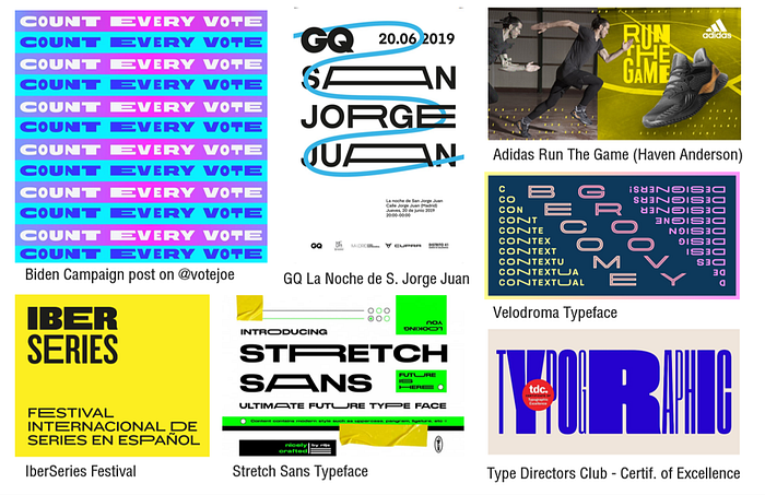
It frequently uses colors that are bold, vibrant and saturated (e.g. neon) and combinations that are unconventional, jarring (even when using less saturated colors), or even unnatural. One example of “uncomfortable” combinations are equiluminant ones.

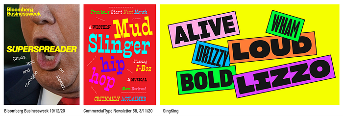
Shapes and proportions also use distortion, which we can see in typography. This style often employs type that is experimental (especially with legibility) and plays with contrast and stress.

Other resources that are common are stretched-out and variable type.

In Brutalist design, composition can feel chaotic, with clashing, overlapping or floating elements (instead of being aligned on a grid layout).

Trap
Trap is one of the most popular music genres in the last couple of years, not only in itself but also influencing many other music styles as well.
Musically, some of its key elements are its rhythmic patterns (most noticeably triplet hi-hat and snare rolls executed on synths), and chord progressions that create an atmosphere that is gloomy and haunting (often through the use of minor scales).
Its lyrics reflect different aspects of life experience in urban areas, especially in southern United States (such as urban violence, drugs and sexuality), while the vocals make heavy use of Auto-tune (which make them sound robotic-like) for artistic effect.
Visually, trap videos play with distortion, and often feature a trippy aesthetic (as if under the influence of drugs). We can see this both in the color combinations as well as in the visual effects (such as the vertigo effect in Sicko Mode).

Billie Eilish
Billie is one of the most relevant artists today, both commercially and creatively. Musically, Billie has a very distinctive vocal style, marked by a soft, whispered delivery and the use of the signature “flutter” effect (which makes the voice sound as if being heard through a fan); along with a minimalistic production and experimental sounds (e.g. from a dentist drill).
Her lyrics frequently go together with her intimate vocal style, exploring topics like mental health: her 2019 album, “When We All Fall Asleep, Where Do We Go?” references themes of lucid dreaming and night terrors.
Visually, her videos reflect this through different images that can be creepy, eerie, surreal and sometimes unnatural. Her image also uses very contrasting elements like black and white, neon and desatured colors, and luxury brands and sportswear (we can think of this as accompanying the contrast between soft vocals and disturbing sounds).

The visual styles we presented play with our perceptions and our ability to distinguish between what’s real and what’s fiction, virtual, a hallucination or a dream.
While many of these elements are not new, the fact that they are simultaneously popular suggests something else: it could be a reaction to the perfectly-polished images that Instagram displays.
But perhaps, unsettling as they may feel, these styles could also provide a form of relief: by turning our inner fears into something visible, they may help us face and process them.